
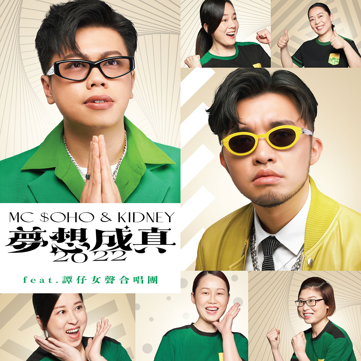


[Marketing Seed 147: Edgy vs. Wabi-Sabi ⑥]
📊 “A Difference in Design Philosophy is a Difference in Delivery” The difference between K-POP and J-POP is not limited to their expression styles. There
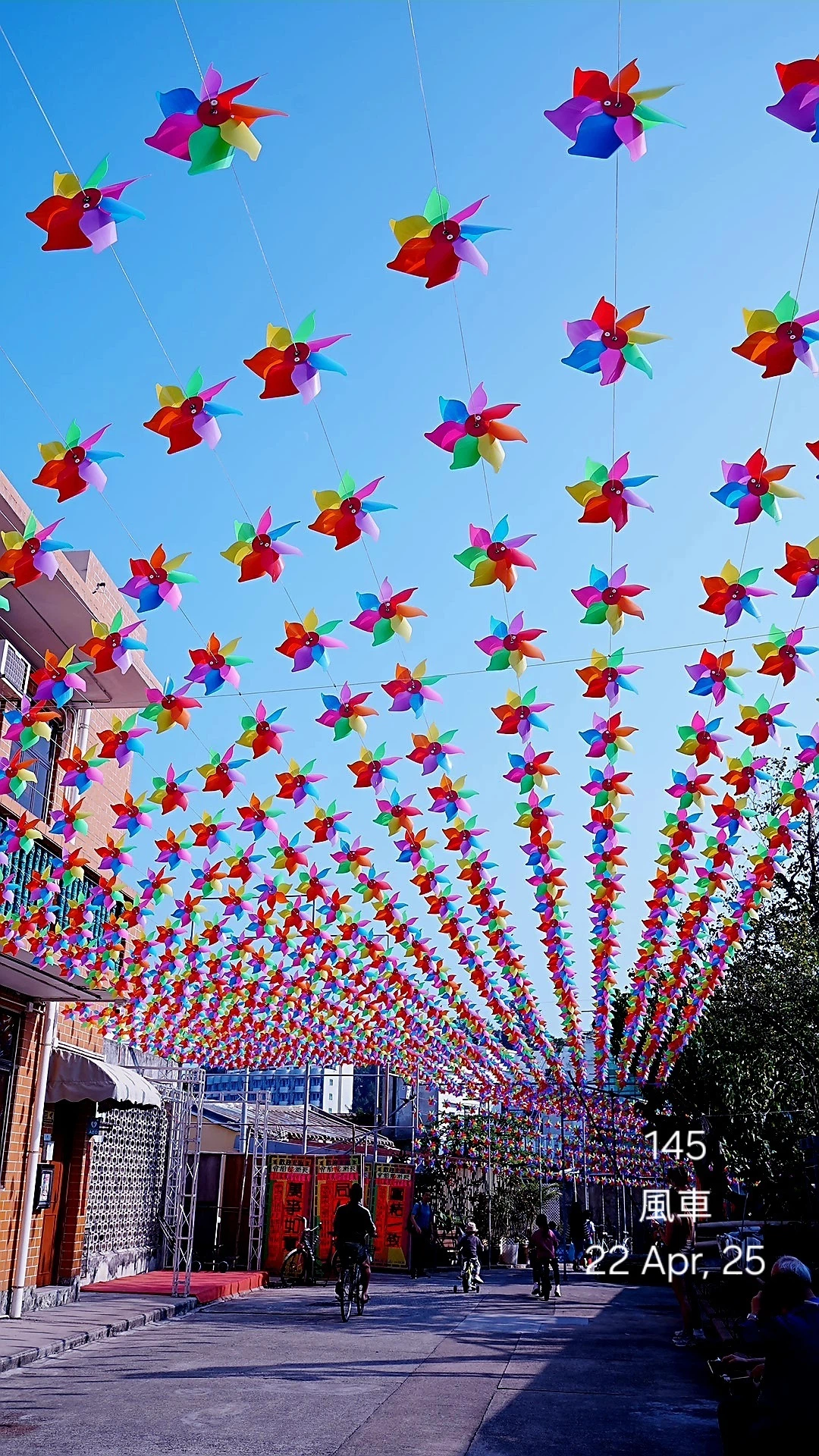
【香港図鑑145:風車】
「風が運ぶ、見えない願い」 長洲(チョンチャウ)の細い路地を歩いていると、ふいに頭の上で「カラカラ」と軽い音がします。見上げると、軒先に吊るされた色とりどりの風車が風にあおられて、くるくると回っていました。赤、金、緑、ピンクの鮮やかな紙やプラスチックの羽根が光を反射して、狭い路地にきらめく小さな渦を描いています。🏮

【マーケの種147:キレッキレか侘び寂びか⑥】
📊 「設計思想の差異は、届け方の差異である」 K-POPとJ-POPの違いは、表現スタイルのみにとどまりません。どのように届け、どのように受け取られるか──つまり「流通モデル」そのものに明確な差が存在しています。