
🍷 Designing “Special Moments” — How Color and Space Support a Restaurant’s Appeal
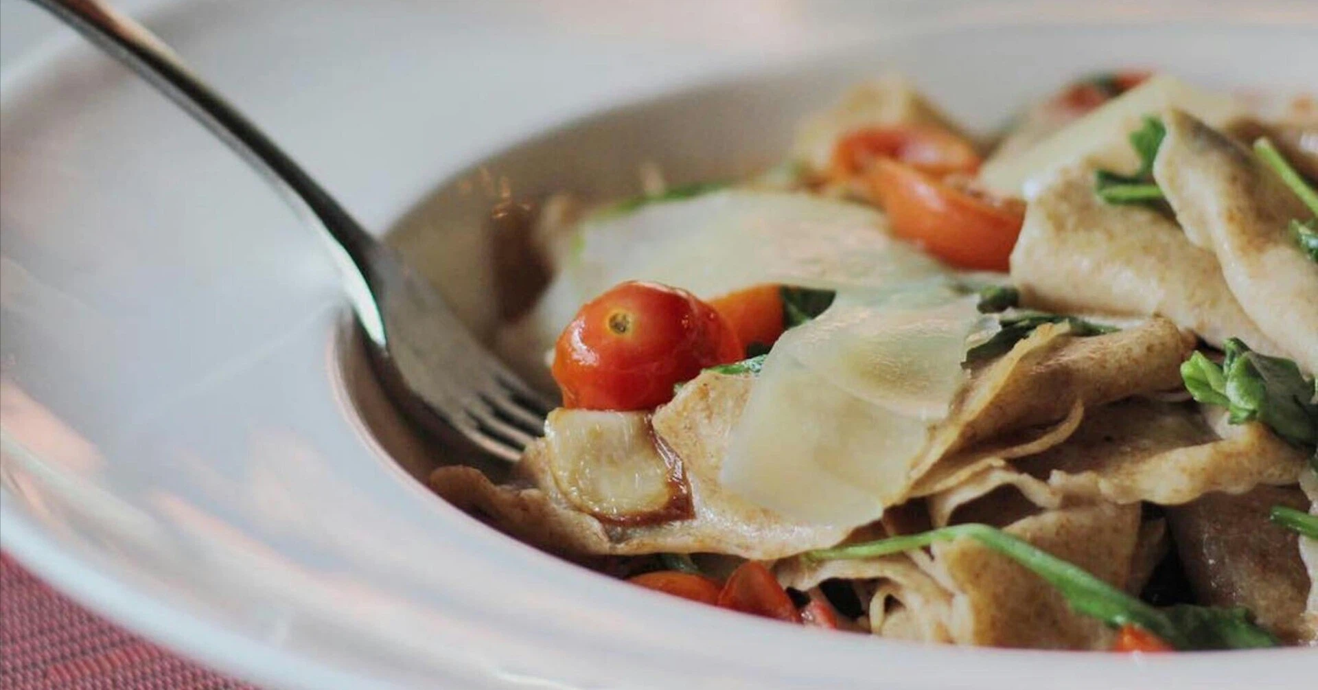
The red and gold Italian restaurant is an establishment specialized in providing a “special time.” The interior decor is glamorous, with a unified selection of lighting and furniture. The cuisine is authentic, and the price range is relatively high. The target audience is a demographic seeking a sophisticated dining experience.
🎨 The Meaning of Color and Cultural Affinity
The restaurant’s characteristic color scheme—Red and Gold—does more than just catch the eye; it holds cultural significance.
-
Red: Symbolizes passion and excitement.
-
Gold: Symbolizes wealth and prestige.
For people in Hong Kong, these colors are familiar and evoke a positive impression. By incorporating these colors into the interior design, an atmosphere of “luxury” and the feeling that “something special is about to begin” is naturally cultivated.
Related Article: Adobe “Colour Psychology in Marketing: Choosing the Right Palette.”
👔 “Why Do People Gather in This Space?”
Those who gather at this restaurant include:
-
Couples wanting to celebrate an anniversary.
-
Business professionals planning receptions or dinners.
-
Younger generations wanting to stretch their budget for a special date.
They are all looking to spend “quality time.” While the deliciousness of the food is a factor, the purpose is just as much “the act of being in this space itself.”
💬 The Value of “Going There” Being the Meaning
Going to this restaurant has perhaps become a bit of a status symbol.
-
It becomes a topic of conversation.
-
It makes you want to post photos on social media.
-
It becomes a shared experience (“Have you been to that place?”).
In other words, we can perceive the total value as: “Taste” + “Space” + “Impression” = Comprehensive Experience Value.
📝 (To be continued…)